Best Tips on Effective Signage for Your Business

INTERESTING ARCHITECTURE TRENDS
Lorem ipsum dolor sit amet consectetur adipiscing elit obortis arcu enim urna adipiscing praesent velit viverra. Sit semper lorem eu cursus vel hendrerit elementum orbi curabitur etiam nibh justo, lorem aliquet donec sed sit mi dignissim at ante massa mattis egestas.
- Neque sodales ut etiam sit amet nisl purus non tellus orci ac auctor.
- Adipiscing elit ut aliquam purus sit amet viverra suspendisse potenti.
- Mauris commodo quis imperdiet massa tincidunt nunc pulvinar.
- Adipiscing elit ut aliquam purus sit amet viverra suspendisse potenti.
WHY ARE THESE TRENDS COMING BACK AGAIN?
Vitae congue eu consequat ac felis lacerat vestibulum lectus mauris ultrices ursus sit amet dictum sit amet justo donec enim diam. Porttitor lacus luctus accumsan tortor posuere raesent tristique magna sit amet purus gravida quis blandit turpis.

WHAT TRENDS DO WE EXPECT TO START GROWING IN THE COMING FUTURE?
At risus viverra adipiscing at in tellus integer feugiat nisl pretium fusce id velit ut tortor sagittis orci a scelerisque purus semper eget at lectus urna duis convallis porta nibh venenatis cras sed felis eget. Neque laoreet suspendisse interdum consectetur libero id faucibus nisl donec pretium vulputate sapien nec sagittis aliquam nunc lobortis mattis aliquam faucibus purus in.
- Neque sodales ut etiam sit amet nisl purus non tellus orci ac auctor.
- Eleifend felis tristique luctus et quam massa posuere viverra elit facilisis condimentum.
- Magna nec augue velit leo curabitur sodales in feugiat pellentesque eget senectus.
- Adipiscing elit ut aliquam purus sit amet viverra suspendisse potenti .
WHY IS IMPORTANT TO STAY UP TO DATE WITH THE ARCHITECTURE TRENDS?
Dignissim adipiscing velit nam velit donec feugiat quis sociis. Fusce in vitae nibh lectus. Faucibus dictum ut in nec, convallis urna metus, gravida urna cum placerat non amet nam odio lacus mattis. Ultrices facilisis volutpat mi molestie at tempor etiam. Velit malesuada cursus a porttitor accumsan, sit scelerisque interdum tellus amet diam elementum, nunc consectetur diam aliquet ipsum ut lobortis cursus nisl lectus suspendisse ac facilisis feugiat leo pretium id rutrum urna auctor sit nunc turpis.
“Vestibulum pulvinar congue fermentum non purus morbi purus vel egestas vitae elementum viverra suspendisse placerat congue amet blandit ultrices dignissim nunc etiam proin nibh sed.”
WHAT IS YOUR NEW FAVORITE ARCHITECTURE TREND?
Eget lorem dolor sed viverra ipsum nunc aliquet bibendumelis donec et odio pellentesque diam volutpat commodo sed egestas liquam sem fringilla ut morbi tincidunt augue interdum velit euismod. Eu tincidunt tortor aliquam nulla facilisi enean sed adipiscing diam donec adipiscing ut lectus arcu bibendum at varius vel pharetra nibh venenatis cras sed felis eget.
A fairly inexpensive form of advertising is signage. Designing indoor signs and outdoor signage involves many issues. Before getting a sign made, an individual must know how many considerations need to be made. Your sign should increase engagement and attract people to your establishment without overpowering it.
The purpose of your sign is to quickly and effectively convey your message; therefore, you'll need the ideal sign design that complies with the guidelines mentioned below.
What Makes A Good Sign? Effective Sign Tips
What makes a good sign? Four factors, in our opinion, are crucial:
- Sharp focus on key users for the audience.
- Design, brand, location, and visibility of the message.
- Environment: the position of the sign and the surrounding structures.
- Durability, information, static or interactive, and function.
Regardless of the form of the sign, the main goal of a sign is to transmit a message. Typically, this communication is brief and to the point. Any sign's main goal is to convey a message quickly and as feasible.
Graphic designers utilise the following design concepts to produce eye-catching, high-impact signage that is intelligible, pleasing to the eye, and carries the maximum impact:
Choose the Right Type of Signs.
When deciding which sign to employ, it's crucial to comprehend its intended usage. Your budget is one of the most crucial considerations when deciding on the sign to use, but regardless of how much or how little money you have available, you still need to think about your target audience and the message you want to convey to them. While some signs are effective at conveying particular messages, others are not.
For instance, yard signs and banners are ideal for displaying outside near the road or other high-visibility areas, whilst wall decals and floor graphics are a wonderful choice for interior use or stores.
Leaving the Perfect Message
What does your sign intend to accomplish? Is it merely to direct them, to advertise a special offer, or to do a grand opening? And who is your target market? Which message will people respond to most favourably? Ensure your message resonates with your audience and achieves its goal if you want to craft the ideal message.
Consider how you specifically target your message to your audience while designing a restaurant sign. What matters most to them, and how can the messaging on your sign make them feel like they are getting the best deal? Do they care about pizza specials, rewards programs, or happy hour? Plan your signage, keeping related factors in mind.

The Use of Color & Contrast
Effective signage requires careful colour selection and contrast in your sign design. Based on the kind of sign you are developing, you should utilise your brand's colours to preserve brand consistency or complement and symbolise your brand and message. For instance, a sign with your logo must be consistent with your brand's colours, yet a sign advertising a sale can use other colours while still representing your brand and conveying your message.
Additionally, utilise contrasting colours consistently throughout your sign to help it stand out and to improve readability. Keep dark typefaces on light backgrounds and light fonts on dark backgrounds.
Remember Consistency
Consistency is key when designing restaurant signs. Brand consistency is crucial to maximising your outcomes and increasing brand awareness; your sign designs should reflect this.
For instance, if you have a table tent, poster, and banner all promoting the same message, such as a large scale, you want the design to be consistent throughout them. The more often someone sees something, the more likely they will remember it and act in your favour. If you need a company dealing with van signwriting in Brighton, contact Odysea Signs for the best deal.
Keep your Design Simple
Remember that the most effective sign design is straightforward, uncomplicated, and beautiful. Keep the design straightforward whether you're creating a poster, banner, window graphic, storefront sign, or any other interior or outdoor signage.
Make sure your sign includes the following to keep your sign's design straightforward:
- A brief, appealing message that drives curiosity and goes to the point
- Sufficient white space between design elements to improve readability and make each thing stand out more.
- Only use a few design components; 20 pictures on one sign will look overwhelming and turn people away.
While less is more, in sign design, keep your remarks brief. The average person will only glance at your sign for a brief period. Therefore, you must immediately capture their attention. Contact Odysea Signs for vehicle wrapping in Brighton if you need stunning signage.
Choose the Best Font.
For optimum legibility, you should utilise simple, clear, easy-to-read typefaces. Most professional typefaces come in weights, such as regular, bold, extended, and black. Utilise these to your advantage by giving particular elements of your message more importance or precedence.
Never use more than two different typefaces in a single design, as a general rule of thumb. Your message can stand out by using two complementary typefaces. The most crucial thing is to select fonts that are easily readable at a distance. Odysea Signs keeps all these factors in mind beforehand to provide you with the best experience in vehicle graphics in West Sussex.
Use of Image
Reading speed might increase by up to 25% when a border is added. When car traffic is the target audience, borders are frequently advised. They frequently make the eye fixated on the message. You can also use full-colour digital photographs to increase the impact of designs. You must include additional graphic components like logos and illustrations to improve the style and layout aesthetically. For more tips to make your signage impactful, contact Odysea Signs, among the best sign makers in West Sussex.
Keep it Visible & legible.
Less is more. Your sign will be simpler to read and understand if you keep your message brief. Make sure the size you choose for your sign or exhibit is appropriate for the viewing distance you anticipate. Signs come in all different shapes and sizes. Take into account the location and any potential roadblocks. The most crucial aspect of your signage is visibility.
Odysea Signs are among the best sign makers in Sussex, and keep these factors in mind while designing your signage to get you the maximum leads.
Keep Headlines short
Ideally, 3 to 5 words. For optimal legibility, select clear, crisp, easy-to-read typefaces, and avoid using capital letters excessively. Text in upper and lower case is easier to read at a distance than text in upper case. Finally, use two typefaces at most in a single design, and make sure they work well together and are legible from a distance. Generally, a sign's surface area should include between thirty and forty per cent white space for best readability. In case you are wondering about a sign shop near me, all you need is google, and you will find the top-rated sign makers in your locality.
Scale the size of the Sign to the Environment
When creating your sign, keeping the environment in mind is crucial. Your goal is for the surroundings to enhance and elevate your sign.
Signs that are improperly used or positioned can frequently cause misunderstanding or distort the information you are attempting to convey. For instance, it is preferable to display a "grand opening" sign at the door to your establishment.
Additionally, you want your sign to be distinct from the surroundings. Avoid using too many reds or other hues that will blend into the brick and impair legibility, for instance, if you're placing a wall sign on the red brick of your building's facade.
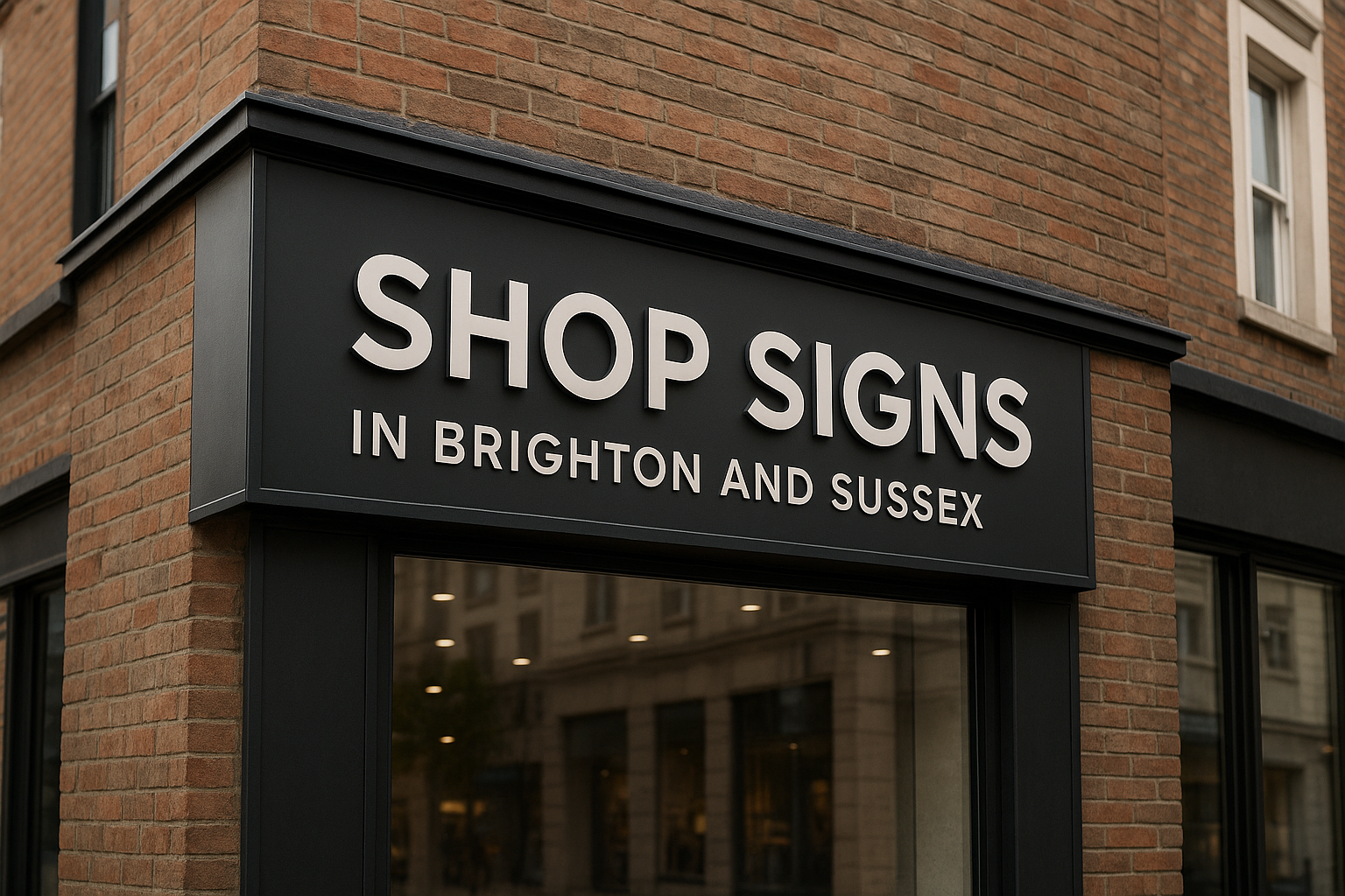
Hire Odysea Signs in West Sussex
For the most powerful, imaginative, and reasonably priced sign designs, get in touch with the top Brighton sign company, Odysea Signs. We are prepared to create effective signs once you and our staff have decided on the best setting, material, message, and design.
Our wide-format and bespoke signage professionals at Odysea Signs are here to help you design the ideal sign that satisfies your needs and your budget. Contact us to learn more about our most well-liked signage and to get started!